Feed on
Posts
Comments

Ryanair recently announced a 32% jump in profits and their quiet CEO puts this down to a changed image and that they have stopped ’unnecessarily pissing people off’, according to boss O’Leary.

Ryanair being nice

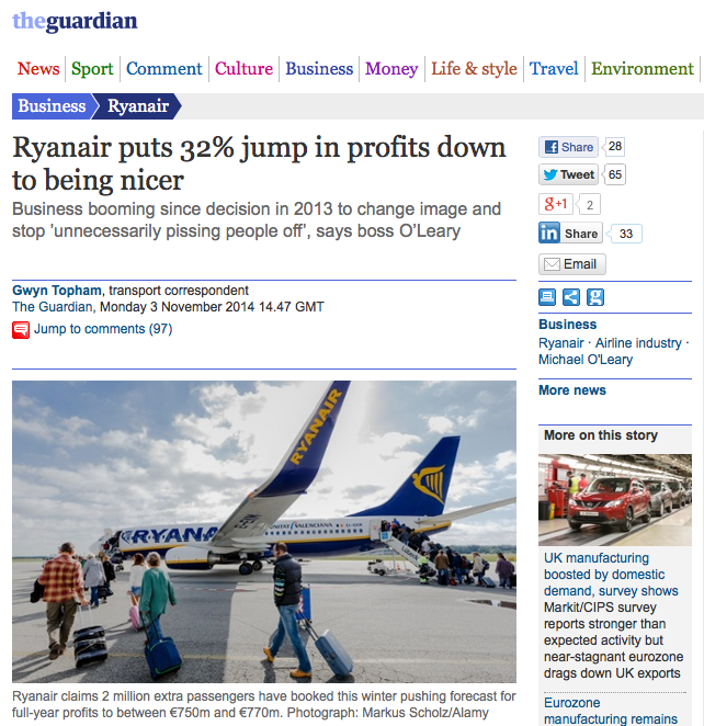
The Guardian newspaper (link) describes this nicely, including presenting a few great quotes from the master himself, Michael O’Leary.

“The underlying trend is enormously positive. Since we changed the strategy, being fundamentally nicer to our customers, the business has boomed,”

This is supported by a reduction in the number of complaints by 40%, and a growth in passengers of 2 million. This is enough of an incentive for Ryanair to order new aircraft and have an optimistic view of the world.

“As a result of this being nice to the customers, bookings and traffic are rising, and we’ve gone out and ordered another 200 aircraft in the last six months so we can double in size”

So, next time you have a discussion in your project group about the economic benefits of offering customer friendly solutions, just quote Ryanair:

“What we have been doing is significantly improving the customer service and it is working like a dream.”


But, remember to quote Ryanair anno 2014, and not the earlier incarnation. You might end up with this:

“You’re not getting a refund so fuck off. We don’t want to hear your sob stories. What part of ‘no refund’ don’t you understand?”

I haven’t flown with the “new Ryanair”, and still have the earlier of quotes in my head and a deep-seated reluctance to go back to them. However, hats off to them for turning around. Changing an organisation from ignoring customers to at least considering customers within a two year period is quite some achievement. It might even be a great case study of organisational change.

Think like a patient, act like a tax-payer: This was one of the more interesting take-aways from Simon Stevens’ recent speech about the new focus of the National Health Service in the UK.

Think like a patient

Although the sentence might be seen as a bit of cheap spin, I think that if most health services asked themselves if they think like a patient, then, with hand on heart, they would probably say no. My experience from working with health services in Scandinavia is that they strongly believe that the health service was established to serve the patient. However, they stopped thinking like a patient a long time ago. Something happened in the 80’s and 90’s that pushed them to think like efficient industrial organizations, and to do that, they turned their back on the patient (and also on what a service is all about). There was a belief that by becoming efficient organizations, that they would naturally serve patients in a better way, and that the patient benefits would be a logical consequence of their analytical thinking. The thought was very much upon  patients, who were predictable and malleable, and therefore did not need to be considered. Gradually, the patient became more and more a distant stakeholder in a hunger to develop systems that looked fantastically good on paper. However, we all know now that you cannot remove the user from the equation, and there is a need to bring the patient back, at both the macro level and the micro level.

So, how do you think like a patient and act like a tax-payer? Add Service Design. The reason for this is that I think Service Design is really good at thinking like a patient (and to a large extent has a fairly good understanding of business economics). However, I think that the natural tendency of a service designer is to think like a patient (or user, or customer – dependent upon situation). That is one of the great strengths of Service Design. However, I do believe that it needs a counter balance. In many ways, the counter-balance already lies in the projects, due to it being built into the culture of most health organizations for the past 30 years. Time and time again I meet a culture in service providers which is focused upon themselves, how they do things and how they would like customers to fit into this self-view. Instead of seeing this as being something outdated, I think that it can offer this counterbalance to the Service Design view. So, maybe the answer to thinking like a patient and acting like a tax-payer is to just add Service Design? Experience from various projects seems to point to the same conclusion. It’s a small addition, but a very valuable one.

I have always been a bit sceptical to the idea of demographic segments, although I guess broadly there are age cohorts that have similar needs. However, I think if you rather look at groups with similar needs, without specifically focusing upon age, then you are more likely to develop the right services and experiences.

I therefore read one of the useful trend-briefings yesterday with great pleasure. It not only says things clearly and succinctly, it also gives a few examples of how you can design for a non-age demographic. One of the key paragraphs I think is one that explains how status symbols are not connected to money anymore, but rather to experiential value.

New demographic


The above text from the briefing (link) says it nicely, and there are some good statistics to support this. For example:

While 48% of those who had used ‘neo-sharing’ collaborative consumption platforms (such as Airbnb, Zipcar and Kickstarter) were aged 18-34, 33% were aged 35-54 and 19% were aged over 55.

CROWD COMPANIES, MARCH 2014

I still think its true that the younger demographics are willing to experiment and are quicker to pick up on radically new things, but I also think that there are a lot of new services that are not radically new, and appeal across all demographics.

So, next time you are discussing with a client about target segments, get them to read the trend-briefing, and show that the age demographic should not necessarily govern the way they view the world.

I think the cool brands initial is very interesting, particularly the way they decide upon the winning 20. The results for 2014 have just come out, and surprisingly (or not surprisingly depending upon how you view them these days) Apple came out on top. This is before the new phone, watch, health system, payments solution etc that they just launched.

Applewatch

Have a look at the list here (link) and have a think about how many service providers there are there (nice to see Spotify there). Have a think also about the ones that are not there, (Starbucks is notably absent for example).


I have become fascinated by the degree of self-expression that todays culture encourages. I have no positive or negative opinion of whether this is a good thing, but it seems to be something that is becoming more and more prevalent as time goes on. One of the examples I often use is how the Beats headphones have become embraced by people as a statement of being part of something cool, and therefore becomes a pointer to being cool themselves. This is nothing new, but it is spreading to almost everything in society.

Over on Brand Republic (link) they had a short piece that sums it up really well, and a service that caters for the need. It quotes Heather Cork, North American vice-president of the Future Foundation, who says:

Consumers are constantly polishing the image of themselves in the real world in order to post it in the online world

Not only this, it has an interesting statistic: 30% of millennials added that they wished they could be more like their online selves. This leads to interesting behavior – online selves become desired selves, and then the real self strives to be authentic to the online self. This is a kind of search to develop an authentic self based upon what is considered an external view of self as viewed online.

Not surprisingly, we are willing to spend a considerable amount of effort and money preening our desired selves, as the Beats example shows. Now, some enterprising graduates have started to help those on their identity and image mission, by providing #noshittyphotos (link). They spray footprints on the ground at famous tourist destinations to help you take the picture that makes you a better photographer (if only they could make an app with super precise GPS, then we wouldn’t have to find the footmarks).

In that way, you can become a better photographer, so that can add to the image that people have of you. Until of course, they ask you to take some photos for them, at a place without footmarks.

The reason I am intrigued by this, is that there must be a huge service potential to cater for this need of refining the online self and linking this to the real world self. Coffee shops do this already, to a degree, but this takes it online – digital services supporting your online image and how this can enhance your real image and self. Now thats an interesting area to explore.


Thanks to Alfred Holmen (link) for this link to a great infographic over at cool infographics (link).  It brings home the size of the service sector in the US. I scrolled down the services section and thought wow! but then realized that the total service sector also includes the public service part too.

It would be great to compare this data with the amount of research funding placed in each sector, or even the amount of design teaching spent on each sector.

Every-Job-In-America

OK, it took long enough, but now you can download the cards from the download section, or just click here  AT_ONE_CARDS

Check out the other downloads too, they might be useful also. All are available on a creative commons Attribution-NonCommercial-ShareAlike 4.0 International (CC BY-NC-SA 4.0) copyright (link). This means you can use them free of charge, adapt them but not use them for commercial purposes. You can use them in your commercial practice, as is, if you attribute them, but you cannot sell these downloads. Downloading these files shows your consent to these rules.

The cards are placed 8 on a page and should print well on any printer. Alternatively you can get a local printer to print them on business-card thickness card. There are crop-marks to help you cut them. Print on the stiffest paper that your printer can take – it makes a difference.

BoxTest3

We have reduced the resolution to make the download bearable. I have tested the images and they seem fine in this version for printing. If you want a higher resolution version, then get in touch and I can send you a larger file. 

I just saw this on the BBC site (link) describing the connection between movement and cognition.

gesturing

It seems like finally body and mind are being re-connected, and its about time. I think that Service Design has understood this for quite some time, in terms of how it runs workshops and uses artefacts to improve workshop results. The visualization of ideas is one way of doing this, and so are the multiple tangible tools that are specifically designed for workshops.

I have written earlier and researched the touch-point cards, and each time I use them, I realize how much the physical holding and manipulation of the cards aids memory and cognition. Not only this, the shared visual and physical nature helps create shared understanding. In research terms, these are described as boundary objects – objects that have shared understanding across disciplines. For the researchy among you, here is a (link) to some of the research I have been doing including the touch-point cards.

We are presenting a paper at the ServDes 2014 conference (link) about using tangible objects to assist strategic conversations, and this will be uploaded when published. There are also other things worth noting at ServDes, including a workshop by my heroes Jacob Buur (link) and papers by Eva Brandt (link) and  Mette Agger Eriksen (link).

touch-point-session

We are also just about to carry out some work looking at the development of tangible tools that can be used to assist companies in understanding what it means to deliver memorable customer experience as part of the experience centric-organisation (link).  More on that later, but until then, think hard about going to ServDes 2014 to find out more about co-design using body and mind.

experience centric labelled

Ted from AHO sent me this today (link). It’s an advert for a house that is for sale in Oslo, and yes, its very pricey. It’s in Norwegian, unfortunately, but the images speak for themselves. However, what I really like about it is the imagery they use. They have staged and created a story about the house and the different flats (its five flats) to help spark your imagination. Each has been quite cheaply styled, but its the overall concept and each micro-story. From the exotic main flat, to the scientists lair to the old persons basement, they have crafted a fictitious atmosphere and experience for the building.

Have a look at some of these images:-

Kampen 1

Kampen 6 Kampen 5 Kampen 4 Kampen 3

Kampen 7


This, creates together a really positive impression about the flat and some history (however fictitious). Everyone I have shown it to thinks its a cool building, and would like to live there. I doubt if an average sales presentation would give that same instinctive desirability. If you look closely, the first image, with the party in the garden, introduces all of the characters that appear in the following images. Clever.


I have always considered the health information on packaging as being quite abstract. Reading about the calorific content of my morning musli, and the amount of energy in carbohydrate form doesn’t really tell me that much. I have become better at understanding the data, and use it every now and again when choosing different products, however, I have always lacked a visualisation of the information, so that it converts passive facts to active meaning for me.

Image from article, provided by New York City Health Department

Image from article, provided by New York City Health Department

This is exactly what Sara Bleich of Johns Hopkins Bloomberg School of Public Health has done, and she has tested the results. This is reported in scientific american (here) and in her research paper (here).

She tested four alternative ways of representing the calorific content of some drinks, and it turns out that converting the information into exercise equivalents had a significant effect.

labels-that-translate-calories-into-walking-distance_3

Image from Dowray et. al. (2012)


Not surprisingly, the transformation of data into meaning had a strong effect, and she states:

When examining the 3 caloric conditions separately, the significant effect was observed when caloric information was provided as a physical activity equivalent (OR = 0.51; 95% CI = 0.31, 0.85).

This is maybe something to consider when considering new rules to combat the unhealthy consumption of sugary drinks, crisps etc.


« Newer Posts - Older Posts »

valentino shoes outlet|valentino rockstud replica|cheap valentino shoes|valentino shoes replica|valentino shoes outlet|valentino rockstud replica|cheap valentino shoes|valentino shoes replica|valentino shoes outlet|valentino shoes outlet