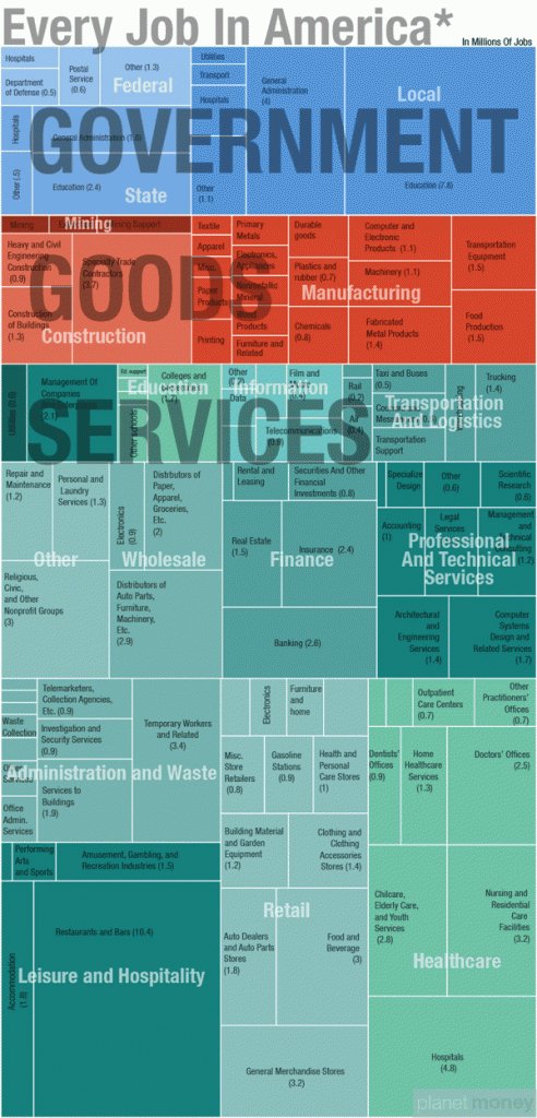
Thanks to Alfred Holmen (link) for this link to a great infographic over at cool infographics (link). Â It brings home the size of the service sector in the US. I scrolled down the services section and thought wow! but then realized that the total service sector also includes the public service part too.
It would be great to compare this data with the amount of research funding placed in each sector, or even the amount of design teaching spent on each sector.
