I just read this piece on CNET (link) about how Apple is well placed in a tech world that is becoming more fashion oriented. Personally, I think that the word fashion is used a little too often to explain our experiential hunger for products and services. It seems like the word fashion is a safe term to use, because in some way we all understand the term. Whether we like it or hate it (and it does divide the waters), it seems like fashion explains away the desire we have for new experiences.
There was one quote that I think stood out for me as being important. I have slightly reworded it here to get the meaning across in a more generic design context, (I removed the Apple word):
the minute they set eyes on an a product, they feel something that they might not be able to define. But it’s something that their hearts and souls identify with. It’s something they want to be a part of.
CNET – Feb. 2015
This is something that gets to one of the core parts of design – making meaning through design. It gave me a flashback to one of my favorite books about design, called The Design Experience by Mike Press and Rachel Cooper. It is from 2003, but is surprisingly fresh today. It describes the role of the designer in this century incredibly well, and although it is mainly product-based, it also opens up for other fields of design. This is how they describe design (again I have edited the text slightly to summarise):
A designer is a maker … the skills of making lie at the very heart of design. The designer makes meaning possible.  Crafting a design solution is merely the first part, which is continued by users of consumers as part of their lives…. Every designed  product, communication or environment provides human experiences. And, all experiences, whether in the city, kitchen, cinema or elsewhere carry meaning and forms of representations. By enabling meaning, the designer is a maker of culture. The designer is a cultural intermediary.
I think this is an important point, and when Verganti talks about innovation in this decade as being a decade strongly influenced by meaning innovation (link), I think we need to understand much more the designers role as enabling meaning and as cultural intermediary.
If we relate this to services and service, then I think it becomes clear that what we are looking for in service is the experience of subscribing, using and building a relationship to a service. This was noted already a long time back by Abbott:
“What people really desire are not products, but satisfying experiences. Experiences are attained through activities. In order that activities may be carried out , physical objects or the services of human beings are usually needed … People want products because they want the experience-bringing services which they hope the products will renderâ€
Abbott: Quality and competition 1955
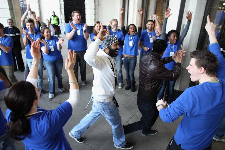
So, what are the Apple equivalents in the world of Service? Well, Apple are pretty good at that too – there are not many retail experiences where both customers and employees clap as you walk into or out of the store.
When my friends enthuse about Uber in Stockholm then it is precisely the meaning that Uber offers that they are enthusing about. There is a certain amount of interest about the functional aspect, but the majority of the comments relate to the experience; the experience of simplicity, control and the feeling that an organization wants to offer you something special and make you feel like someone special. I think Uber offers a great example of modern-day service desirability, in the same way that the article from CNET about Apple talks about product desirability. There are others too, and this points to the fact that service designers need to see themselves as making meaning and that this meaning is core to the service experience. Not only does this meaning have to have cultural relevance, it has to fit the brand of the provider. My colleague Mauricy Filho (link) describes this well, when he describes how services marketing has to move from advertising that tells how great a service is, to designing and delivering the service experience such that people can actually experience how great a service is. Service design is about making meaning and interacting with culture (the spirit of the times, the Zeitgeist). Without understanding the Zeitgeist, and being able to design a service so that it has both has a brand and zeitgeist fit, then we will not have the meaning innovation that Verganti talks about. And that means we will never develop a service that others talk about too.
Tags: Design, Experience, Meaning, Service Design