Comics as evidencing
Written by Simon Clatworthy
I have written a bit earlier about using comics to communicate service design concepts (link), using the launch of Google chrome as an example. I recently came across this really great post:Â What’s Your Comic About?Communicating Complex Ideas With Comics.
This not only describes the importance of using comics as a means of communication, but also gives instructions and guidance about how to do it also. There are plenty of examples, which help communicate the idea, including this one, which fits very well with service design thinking.
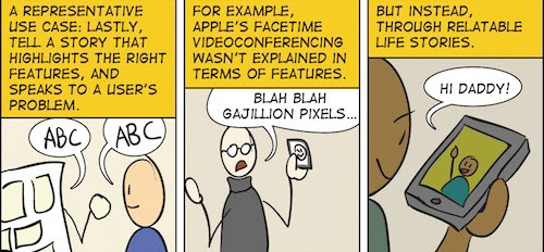
I like this, not only because it explains the concept well, but also because it is not brilliantly drawn. You don’t have to be fantastic at drawing to make cartoons work, you just have to have a really sharp understanding of what you want to say, and how best to say it.
Recent work abroad, the above example, and particularly teaching abroad has increased my conviction about using evidencing as a means of communicating ideas and concepts. I think one of the legacies of product design is that we have a lot of designers who are great at communicating the object in a stunning rendering. These are increasingly becoming 3D renderings, which make the objects look absolutely delicious.
Look at the rendering of the Chevrolet Astro below, and you would be mad not to want one of those. They simplify the reality of the object and turn up on the desire of the object itself.

Image of Chevrolet Astro 1968 from carstyling.ru
In service design, there probably isn’t one object, and if there is an important object, then its the use context that is as important as the object itself. The experience of the service comes into the foreground, rather than the objects. Its the screens, the buttons etc that help make it happen. This is not to say that screens and buttons are not important, but rather to say that they are enablers (important ones – the devil is in the detail too) for the offering and value proposition.
This is what evidencing is about. Evidencing is about developing tangible evidence from the future. It’s as if you travel into the future, and show a situation where the service exists. It shows the service in use, generally through a touch-point being used by someone, so that the touch-point is shown in context. Not only this, the choice of touch-point, stage of service journey and the experiential message is shown in the image. Since services are about experiences delivered over time,  evidencing often needs to show the  time element, to show the service experience as the narrative that it is. Therefore, storytelling and evidencing are very close to each other. The images used in evidencing include a hell of a lot of design detail, but the detail is secondary to the message and the experience that the evidencing needs to convey. This is where using cartoons come in, since in the above example, facetime video conferencing is shown in use, in an experiential context.
The great site, service design tools (link) has a short section on evidencing and shows this simple but effective example from LiveWork.
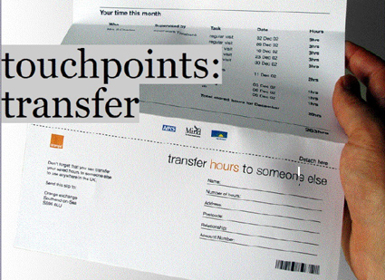
An example of evidencing from the servicedesigntools site.
It shows some work they did for Orange, and the evidencing shows the use context with the hand holding the letter. This allows you to think of the context, for example, coming home from work to find the letter. The letter is folded, as if taken from the envelope, and not shown as a flat pdf of the document. This reinforces the focus upon the context rather than the object, so the letter is not seen as a design specification, rather something supporting an offering. The key part of the image is the text “transfer HOURS to someone else”. This is the key message from the concept – the concept of encouraging customers to transfer unused time to someone else. This is a way for orange to enable gift giving or sharing between people, which is an indirect way of supporting a relationship between the customer and orange themselves.
This might be a far cry from lovely 3D renderings, and might seem a step down for those with such great skills. However, in service design, the medium really is the message.