I have always considered the health information on packaging as being quite abstract. Reading about the calorific content of my morning musli, and the amount of energy in carbohydrate form doesn’t really tell me that much. I have become better at understanding the data, and use it every now and again when choosing different products, however, I have always lacked a visualisation of the information, so that it converts passive facts to active meaning for me.
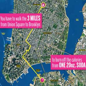
Image from article, provided by New York City Health Department
This is exactly what Sara Bleich of Johns Hopkins Bloomberg School of Public Health has done, and she has tested the results. This is reported in scientific american (here) and in her research paper (here).
She tested four alternative ways of representing the calorific content of some drinks, and it turns out that converting the information into exercise equivalents had a significant effect.
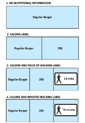
Image from Dowray et. al. (2012)
Not surprisingly, the transformation of data into meaning had a strong effect, and she states:
When examining the 3 caloric conditions separately, the significant effect was observed when caloric information was provided as a physical activity equivalent (OR = 0.51; 95% CI = 0.31, 0.85).
This is maybe something to consider when considering new rules to combat the unhealthy consumption of sugary drinks, crisps etc.