Nice interaction design at Starbucks
Written by SimonC
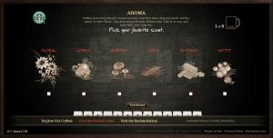
I guess I have hammered Starbucks a lot recently, so its nice to write something positive about the prime example of the experience economy. Starbucks has a very nice wizard (link) to help you choose your coffee. A wizard is an aid that breaks a complex decision process up into simple steps, and Starbucks have broken down the subtle traits of coffee into 5 steps. The interaction design is what I like most. Not only does the whole visual design make you thirst for coffee, but the questions and answers are informative and well formulated. Added to this is the use of sliders, which are a strong interaction tool (they give a feeling of control, and a strong combination of the visual to the physical – which users like). It aligns the whole experience around the pleasure of coffee. I also like the fact that the chalkboard they use doesn’t rub out totally. Its a small detail, but one that makes you remember where you have been, and adds a little more realism.
The only minus I have, is that I really think they should have had a buy button at the end of the dialogue, or even a try button. This would give closure and could open for a dialogue between Starbucks and the customer. “Click here to order a trial package for $xx” with the opportunity to get customers to give feedback “how was it for you…”. That could really make the most of the wizard, to open up a strong dialogue between Starbucks and the customer.
